December 31, 2021No Comments

Upgrading to the reMarkable 2

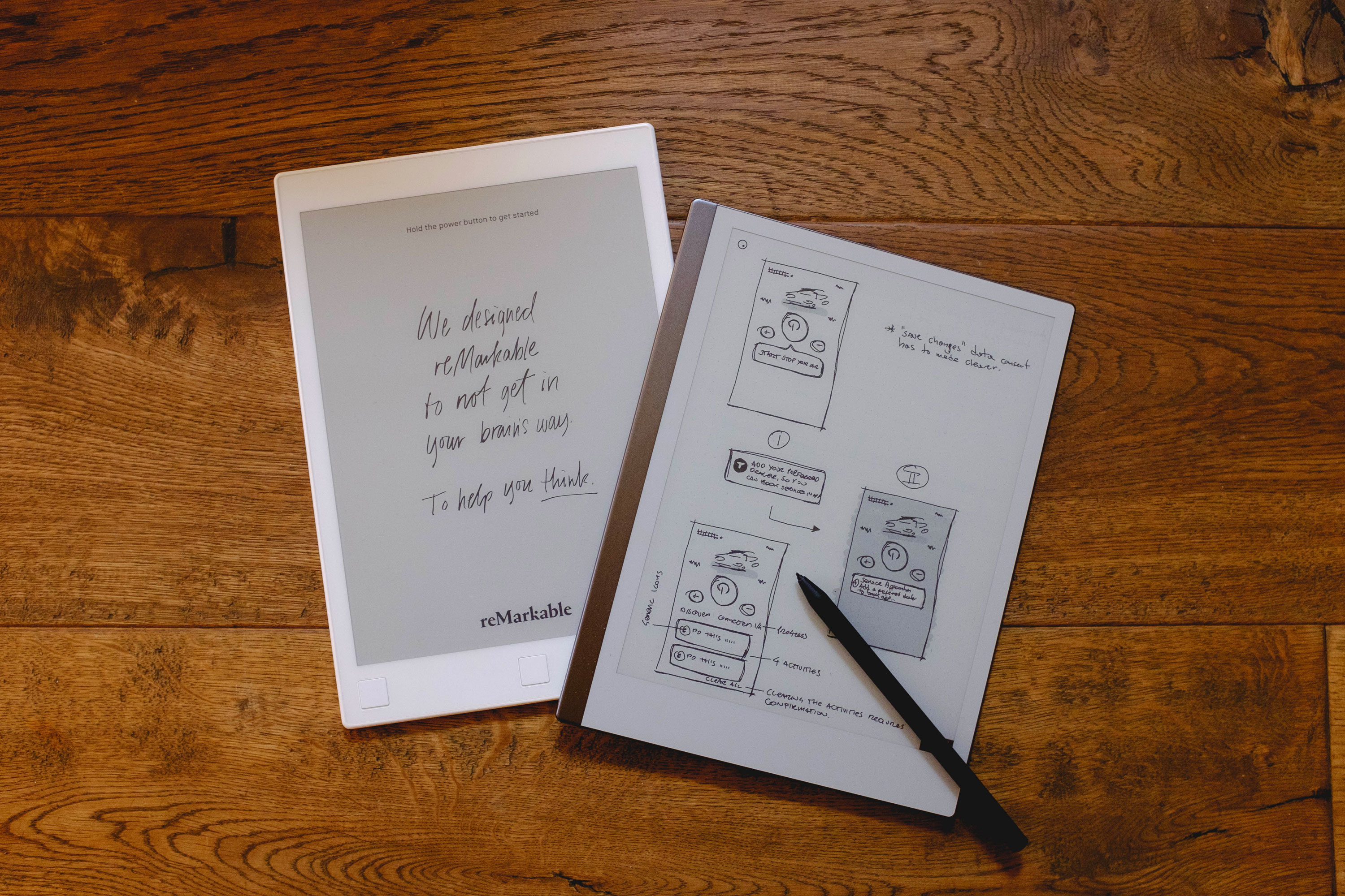
After a cou­ple of years of semi-dai­ly use with my reMark­able, I decid­ed to sell it and upgrade to the reMark­able 2. This has been after final­ly see­ing one in real life, and hav­ing the chance to play with it for a while.

I’ve been a great fan of the reMark­able so far. My main use is both note-tak­ing at work and I also use it exten­sive­ly for wire­fram­ing. I find it quick­er than using paper (as you can copy/paste what you want, quick­ly repli­cat­ing and iter­at­ing each screen) and the abil­i­ty of export­ing every­thing in SVG back on my Mac makes it eas­i­er to share or inte­grate the wire­frames in decks, Miro boards or Fig­Jams with my team.

You can read my ini­tial thoughts about the orig­i­nal reMark­able here. In this post I want to point out what you’d appre­ci­ate upgrad­ing to the new­er mod­el, if you are con­sid­er­ing it, instead.

Design & Construction

The orig­i­nal reMark­able was pret­ty ugly. Stur­dy enough, but ugly. The but­tons were kin­da of annoy­ing when using it in por­trait mode, and became sort of use­less with the intro­duc­tion of gestures.

Despite look­ing sleek­er, hav­ing USB–C (yes!) and a mag­net to hold the pen on its side when not in use, the main improve­ment has to be the glass over the screen. The orig­i­nal reMark­able had a plastic/polycarbonate sheet cov­er­ing the screen. It was some­what flex­i­ble and this cre­at­ed some prob­lems when draw­ing near the edge of the screen, as the sheet would “bend” and give a lit­tle, affect­ing the pen’s sen­si­tiv­i­ty and accu­ra­cy.
reMark­able 2’s screen sur­face is cov­ered by a thin sheet of strength­ened glass. Prob­lems draw­ing near the edge of the screens are a thing of the past, as the glass screen doesn’t bend or deform in any way and doesn’t affect your pen input.

The sur­face of the screen seems to be slight­ly smoother too. This means a tiny bit less drag when writ­ing (I’m using the Mark­er Plus) and a more nat­ur­al feel. On the orig­i­nal reMark­able I always found the orig­i­nal pen & screen com­bi­na­tion had a bit too much fric­tion. On it I used the Staedtler Noris dig­i­tal for a while as its tip had a smoother feel, then set­tled for the orig­i­nal pen, but using the hard­er and more durable black tips. This has improved on the reMark­able 2, as the screen and new pen (and tips) offer a very bal­anced feel (the extra weight of the Mark­er Plus also helps).

The Mark­er Plus has a dig­i­tal eras­er at its back. Works per­fect­ly, and will speed up your writing/sketching. The eras­er will feel a bit weird (drags a bit too much) when the mark­er is new, but this will go away with use, as it will smooth out a bit.

On using the reMarkable 2

Per­for­mance wise it is a bit faster. Let’s say you won’t notice if the WiFi is on or off, as with the orig­i­nal one.

So far I’ve only had one issue: when a note­book I cre­at­ed to do some wire­fram­ing became extreme­ly slow. It took sev­er­al sec­onds for the reMark­able to open the note­book or even just change page, it would hang when copying/pasting some­thing. I’ve been in con­tact with reMarkable’s sup­port this sum­mer about this. They acknowl­edged it was a bug affect­ing some users and it should have been addressed in one of the lat­est firmware updates. It has to be not­ed that the prob­lem only affect­ed one spe­cif­ic note­book. It nev­er hap­pened again. No issues at all elsewhere.

Anoth­er, small, issue I noticed is on eBook ren­der­ing. I do keep a lot of work-relat­ed and ref­er­ence books on my reMark­able, instead of using my Kin­dle. Most of them are in .mobi for­mat and there are some­times some minor font issues or weird for­mat­ting, espe­cial­ly at the end of chap­ters and if (typo­graph­ic) wid­ows are involved. No biggie.

The live screen shar­ing func­tion­al­i­ty intro­duced a few months ago is great. This is essen­tial­ly a VNC con­nec­tion to your com­put­er, where the entire screen of the reMark­able is shared live with­in the reMark­able desk­top app. With the move towards remote work­ing I’ve found it extreme­ly use­ful to quick­ly sketch and share some­thing dur­ing the inevitable Teams/Zoom/Google calls espe­cial­ly those times where I didn’t have access to a stan­dard Wacom tablet (I use one in my home set­up — always handy dur­ing calls, paired with Demo­Pro).

This is, sad­ly, now part of the more expen­sive Con­nect Plan. As an ear­ly user I’m not pay­ing for the Con­nect Plan as it is includ­ed. I under­stand sub­scrip­tions are nec­es­sary nowa­days in soft­ware (espe­cial­ly after a round or two of invest­ments) even though the price seems a bit steep still, con­sid­er­ing the price of the device and what else the plan offers besides screen shar­ing (that can be achieved via a wired con­nec­tion in case…).
Drop­box inte­gra­tion seems a bit basic still, but it has just been released. It would be fair to give the team time to iter­ate on it over the next few updates.

My main issue with the Con­nect Plan is that most times when I try to con­nect the reMark­able with the desk­top app, I get prompt­ed to “acti­vate” my plan, despite it being already active and paired across my devices. I hope this lit­tle bug gets fixed in one of the upcom­ing updates as well.

Despite these few issues, it is an excel­lent device. Most peo­ple would nor­mal­ly crit­i­cise its lack of extra func­tion­al­i­ties, but that is exact­ly its strength. It does one thing. It does it well.

The reMark­able 2 is a defin­i­tive improve­ment over the ear­li­er mod­el. As stat­ed above: screen sen­si­tiv­i­ty & accu­ra­cy has been sen­si­bly improved, the device is faster and the new build qual­i­ty is miles ahead from the orig­i­nal white plas­tic reMark­able. Bat­tery life for me is gen­er­al­ly over a week and this is using the device dai­ly with WiFi always on.

A cou­ple of clos­ing sug­ges­tions: I’m not a big fan of cas­es or “folios” for tablet and phones gen­er­al­ly. The new reMark­able is very sleek and I feel like it is a shame to hide it with­in its folio. I pre­fer to use it “naked”. I only use a sim­ple (and pret­ty cheap at 15 quid) felt case for it when drop­ping it in my bag. You can find it on Etsy.

The sec­ond sug­ges­tion is: you can add your reMark­able as a print­er on MacOS X, lever­ag­ing their Cloud API. I use this all the time to quick­ly send doc­u­ments I have to work on (tons of FRDs usu­al­ly) so I can take notes on them or strike­out what has been com­plet­ed. Print­ing direct­ly to the reMark­able saves you a few steps as con­vert­ing in PDFs and upload­ing via the desk­top app. Def­i­nite­ly rec­om­mend­ed. Step by step guide here: https://github.com/juruen/rmapi/blob/master/docs/tutorial-print-macosx.md

I’d love to be able to see a new reMark­able with the pos­si­bil­i­ty to dis­play a few extra colours (yel­low, blue, red). I’ve played around with ePa­per dis­plays that can dis­play extra colours, but haven’t seen any­thing with fast par­tial refresh still (at least at decent pric­ing) for now. But I hope the next steps will be in that direc­tion. For the time being, and the fore­see­able future, the reMark­able 2 is just the right tool.

Now go, and upgrade.
November 8, 2020No Comments

I Love Your Work | Nov ’20

Giv­en my well doc­u­ment­ed obses­sion with every­thing using e‑ink, I could­n’t miss Bryan Boy­er’s Very Slow Movie Play­er.
God is in the details.

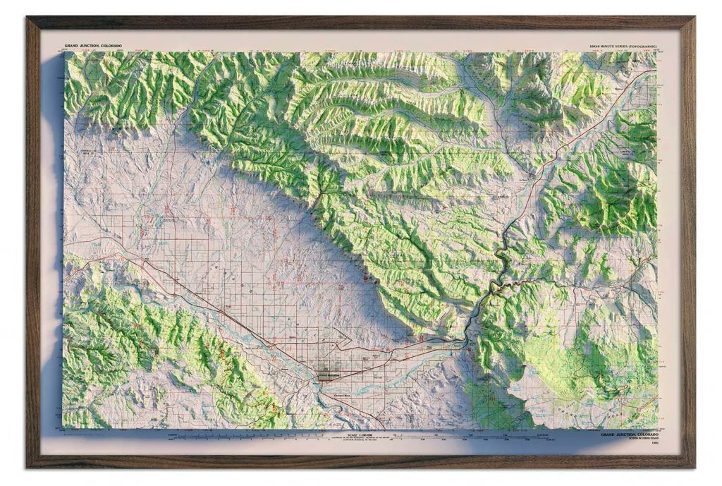
Do not miss Sean Con­way’s stun­ning maps with 3D ren­dered ele­va­tion data. Prints avail­able on his web shop here.

Ele­phant Mag­a­zine: Ane­ta Bar­tos: Fam­i­ly Por­trait 2015 – 2018
From the age of eight, Ane­ta Bar­tos was raised by her father alone in a small city in Poland. In 2013 Bar­tos, who now lives in New York, spent the sum­mer back in her home­town shoot­ing her father, a com­pet­i­tive body­builder. “At the age six­ty-eight, my father asked me to take a cou­ple of shots doc­u­ment­ing his body,” Bar­tos explains. “He has been involved in com­pet­i­tive body­build­ing for over half a cen­tu­ry, and want­ed to be immor­tal­ized in a beau­ti­ful and artis­tic way before his body degenerated.”

And back deep into dig­i­tal geeky­ness:
Inter­face in Game: an online library of UI in gaming.

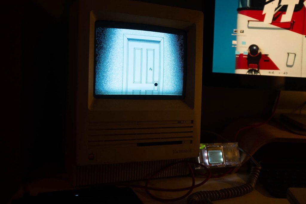
Hyper P.T. is the recre­ation of Koji­ma’s P.T. using Apple’s Hyper­card.
Ryan Traw­ick explains here how he rebuilt the game in great detail.

July 26, 2020No Comments

GoPro as a laptimer for trackdays.

If you are any­thing like me, you’d con­sid­er an hour­glass (or even a cal­en­dar) enough to record your own glacial pace around a race­track, lap after lap. In real­i­ty, even if you are attend­ing track­days with your car or motor­bike, like all of us, just for fun, hav­ing a vague idea of your lap times might be help­ful to under­stand if you are improv­ing your driving/riding or not.

As track­days open to every­one are not com­pet­i­tive, it is for­bid­den to take lap times (at least here in the UK) and despite most sport­bikes hav­ing a timer func­tion embed­ded in their dash­boards, I always found hav­ing to press the but­ton at the end of every lap an unwel­come distraction.

Enter the omni-present GoPro cam­era, strapped some­where on the bike.
I’ve spent the last cou­ple of years, tim­ing my laps at home watch­ing GoPro record­ings of my ses­sions. It gets very tedious very quick­ly (just ask any of your friends you forced to watch said videos) and it is lit­er­al­ly time consuming.

Recent GoPros have an inte­grat­ed GPS chipset, run­ning at 18Hz, that will give you more than enough accu­rate tim­ing with­out hav­ing to buy any oth­er ded­i­cat­ed hard­ware (lap­ti­mer apps and exter­nal GPS receivers).

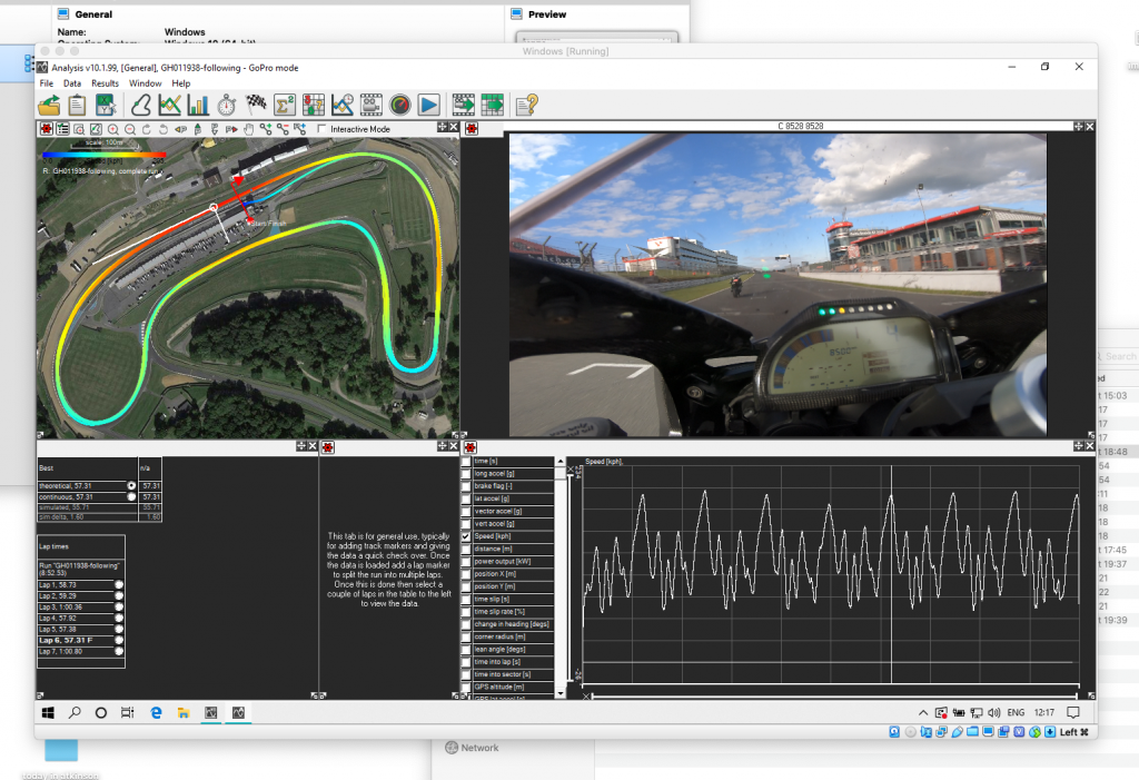
To analyse the data I recent­ly stum­bled upon Race Tech­nol­o­gy’s GoPro Race Analy­sis Soft­ware.
It runs on Win­dows only, but works smooth­ly for me on a Vir­tu­aBox instance on Mac. The inter­face is… fair­ly unfriend­ly at first. It remains unfriend­ly even lat­er on, but you can get the hang of it after a short while.

Screenshot of the software interface.

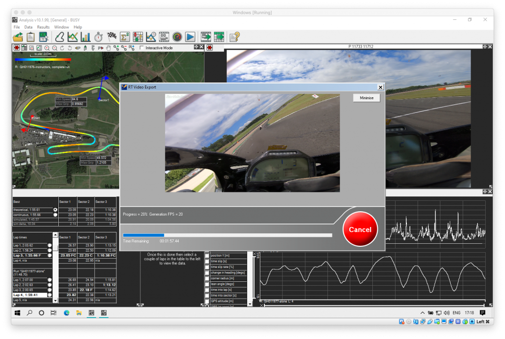
Once the .mp4 files from the GoPro are loaded in, the soft­ware will plot speed, posi­tion, accelerom­e­ter data, cir­cuit lay­out and video pre­view. Once the start/finish line mark­er is added it will cal­cu­late lap times, and sec­tors can be added. You can com­pare laps or sec­tors and export the rel­e­vant data and/or video part.

Screenshot of the software interface.

There are extra func­tion­al­i­ties like maths chan­nels, abil­i­ty to join GoPro chap­ters togeth­er (this is when the GoPro trun­cates videos in sev­er­al 4Gb files), video over­lays, and oth­ers that I haven’t real­ly tried and prob­a­bly won’t, as I’m more than sat­is­fied with it just sift­ing through all the video and giv­ing me the data with­out hav­ing to sit there spool­ing it all.

I’d love to see this run­ning native­ly on Mac or even just have a decent user inter­face but, to be hon­est, it does exact­ly what it says on the tin and it is well worth the £50ish license fee.

March 22, 2020No Comments

I Love Your Work | March ’20

I hoped the 20ies would have been more glam­orous than being stuck, self-quar­an­tined, at home because of Coronavirus.

Start­ed a new job at the begin­ning of Jan­u­ary, it kept me pret­ty busy, so I’ve had much less time to “look at nice things online”, hence the long hiatus.

I’m slight­ly obsessed with maps (this beau­ty hangs in my liv­ing room) and had a go Anvaka’s City Roads. It draws each road from city maps extract­ed from OSM. Results can be export­ed in raster or vec­tor for­mat to play with.
Lon­don Vs Rome:

Exer­cise Book Archive – an ever-grow­ing col­lec­tion
of old exer­cise books from all over the world.

Now, a few play things that will make your GPU/eGPU happy:

david.li – (awe­some) exper­i­ments in WebGL.
Code from the projects on GitHub too!
This is his par­ti­cle sim­u­la­tion in action:

Par­ti­cle Love by Edward Kwan, of Lusion Stu­dio.

Also, in oth­er news, fol­low­ing the recent injec­tion of cap­i­tal, the guys at ReMark­able unveiled the new ver­sion of their tablet, that seems to fix a few short­com­ings of the orig­i­nal ver­sion (bat­tery life, cpu speed) and made it look sleek too: https://remarkable.com/

November 26, 2019No Comments

I Love Your Work | November ’19

Pro­ce­du­ral­ly gen­er­at­ed vec­tor for­mat scrolling Chi­nese land­scapes, by Ling­dong Huang. GitHub repo here.

Been deep div­ing into 3D art late­ly:
Lee Grig­gs, Fed­eri­co Ciuf­foli­ni, his dio­ra­mas are great, and Paar­sec: fol­low her on Twit­ter for a steady stream of 3D and visu­al arts exper­i­ments and links.

Kessel­sKramer for Tim­ber­land.

Brand New’s iden­ti­ty for their 2019 con­fer­ence is phe­nom­e­nal, espe­cial­ly the neon light details and the pro­gram covers!

Crowd­sourced New York hyper­lapse by Sam Mor­ri­son:

And now, for the cute side of the Inter­net…
Seeds of Dream, by Mer­ci-Michel for L’Oc­c­i­tane.
Touch­bar Tam­agotchi by Grace Avery. (GitHub repo here):

November 17, 2019No Comments

reMarkable notes.

I came across the reMark­able a few months ago, after see­ing a video of it used –mag­nif­i­cent­ly– by Pinot Ich­wan­dar­di on either his Twit­ter or Insta­gram stream (you real­ly should fol­low both). 

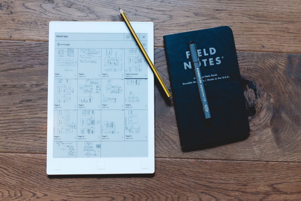
Remarkable tablet shown with Noris Digital pencil & Field Notes notepad.

For those of you not nerdy enough or who actu­al­ly had a social life for the last cou­ple of years, the reMark­able is an 11-ish inch tablet run­ning on Lin­ux with an epa­per dis­play and sty­lus. Its only func­tion is note tak­ing and sketch­ing. It does­n’t do (inten­tion­al­ly) much more.

Read more

October 8, 2019No Comments

Introducing: I Love Your Work

“Intro­duc­ing” might be a wee bit pre­ten­tious. Just a bit.
I Love Your Work is going to be a month­ly col­lec­tion of links to (most­ly) design and pho­tog­ra­phy work that I admire.
The kind of beau­ti­ful stuff that makes you feel both com­plete­ly worth­less and inspires you to do bet­ter next time. 

In the first batch of links for this Octo­ber:
The bril­liant self por­trai­ture of Juno Calyp­so, and some more about her work on the British Jour­nal of Pho­tog­ra­phy.

Juno Calypso - The Honeymoon

Zhenya Rynzhuk’s stun­ning port­fo­lio site. Found via Val Head­’s UI Ani­ma­tion newslet­ter.

Der­ry Bir­kett. UX Design and a very inter­est­ing col­lec­tion of blog posts, both on the site direct­ly and, lat­er, on Medi­um.

Lucas Zan­ot­to. Check his Insta­gram fil­ters too!

Ian Howorth’s pho­tog­ra­phy places south east Eng­land in a delight­ful­ly dark cin­e­mat­ic dimension.

While on the theme of cre­ativ­i­ty (risky word), in today’s era of most­ly cor­po­rate-anaes­thetized con­tent, art, and cen­sored nip­ples, it is worth to sit back and relive the amaz­ing­ly chaot­ic cre­ative process of the leg­endary Nation­al Lam­poon mag­a­zine via Dough Ken­ney’s life sto­ry and the sto­ries about the mak­ing of Ani­mal House. 

Doug Kenney and Chris Miller

In par­tic­u­lar order:
Fat, Drunk, and Stu­pid by Mat­ty Sim­mons;
Drunk Stoned Bril­liant Dead: The Sto­ry of the Nation­al Lam­poon;
A Futile and Stu­pid Ges­ture, on Netflix.

October 2, 2019No Comments

Parpaillon

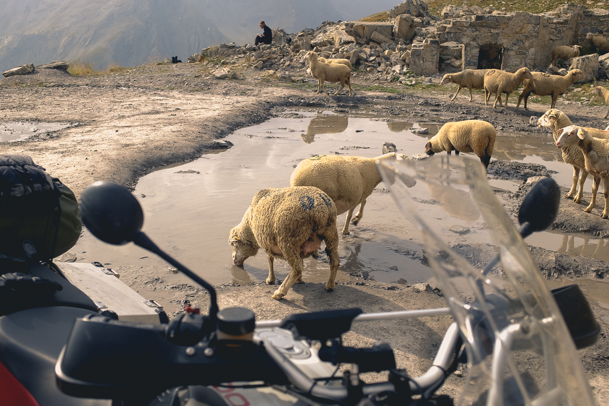
On the way back from Cor­si­ca this sum­mer, er route to meet a cou­ple of friends to ride Furka­pass, Grim­sel­pass, Neufen­pass, Susten­pass (aka the Swiss Roller­coast­er), I took a small detour along a few grav­el roads cross­ing the Alps.

The ini­tial plan was to cross through Col du Parpail­lon, then ride along the Assi­et­ta and pro­ceed towards Susa. Sad­ly the Assi­et­ta is closed for work until next sum­mer and I was able to explore just a very small sec­tion of it (just after the crest). The Parpail­lon was open, and the sun­ny weath­er made for an amaz­ing ride.

Read more

September 23, 2019No Comments

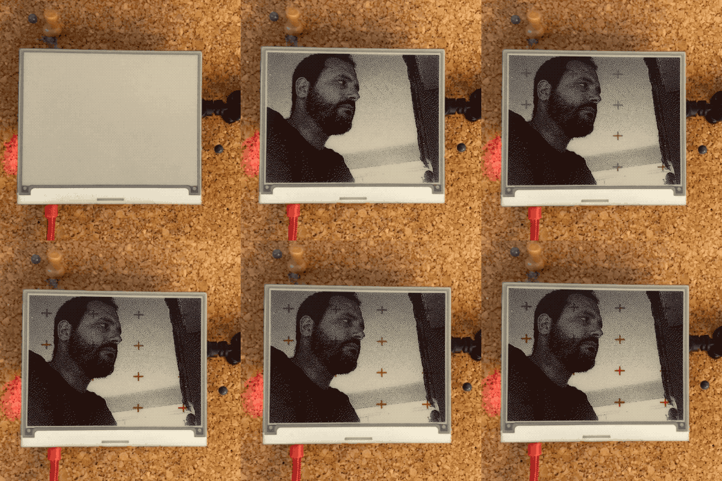
Atkinson Dithering Machine

In the last cou­ple of years I start­ed being more and more obsessed by e‑paper dis­plays. I part­ly blame my Kin­dle – by far my favourite and the best elec­tron­ic device I own to date – and my love for 1‑bit graphics.

My first com­put­er was a Mac­in­tosh SE and most of my ear­ly years in front of a mon­i­tor were spent exper­i­ment­ing with Hyper­card: you tend to devel­op a cer­tain (life-long) taste for black and white graphics.

Before sum­mer I bought an Inky pHAT dis­play and put it to use with a spare Rasp­ber­ry Pi Zero W I had in a draw­er in the office, and my old Playsta­tion Eye camera.
The Playsta­tion Eye works “out of the box” with the Pi: tak­ing pic­tures with it is pret­ty straight­for­ward. The next log­i­cal step for me was to dis­play them as beau­ti­ful dithered black and white images on the small e‑paper display.

Read more

August 12, 2019Comments are off for this post.

Elsewhere

Assort­ed links from around the web for the first week of August.
Great, tidy, prod­uct design port­fo­lio site:
Thi­a­go Dalcin

Prod­uct relat­ed & gen­er­al geek­ery:
The 8 point grid
Ambush (Dig­i­tal Prod­uct Stu­dio)
The Ori­gin of HyperCard

Rhythm in design is every­thing,
I’m aware I’m clear­ly fail­ing at it at the moment:
Ver­ti­cal Rhythm in Sketch

Design ❤️
Ven­mo’s Iden­ti­ty Refresh
IBM’s Plex Type­face
New Iden­ti­ty for Corre­os (Span­ish mail ser­vice)
Link – Idee per la TV (sim­ply beau­ti­ful)
Scope Design Con­fer­ence App